Thursday, 25 February 2010

Contents page draft 2


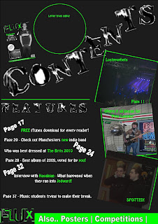
For my second draft of the contents page i wrote out the contents that are included in the magazine. I didn't want too many as i didn't want the page to look too crammed. I used white for the text, and green for the words which i wanted to stand out to the reader. I also put various page numbers in big and bold to make it easier to find.
I am happy with my copy of the front cover featuring on the contents page. I think this is a good technique as it ties in with the letter from the editor by making it more personal.

Front Cover draft 2


For my second draft of my front cover i decided to change the colour of the background to a darker shade of grey. This is so it matched the contents page, and i also think the picture and the texts being white and green, stand out more on a darker background.
As well as this i added a caption for the smaller picture on the page, i positioned this in a white circle and overlapped the white border of the picture. I like that the picture and caption is all in black and white, as these simple colours don't steal too much focus off the main headline.
I have put three smaller white circles in varied sizes leading from the picture to the headline as i think this gives a nice effect.
I like that the design is quite simple and there isn't too much going on which is the effect i was going for. However, i may include a quote from the interview to fill the gap on the ext draft.

Tuesday, 23 February 2010

Weekly Review

This week i have completed a first draft of the front cover and contents page of my magazine. I am happy with the colour scheme that i have chosen of grey and bright green, as i think it stands out well and will draw attention to it.

I also like the layout of the front cover so far, as i want to keep it quite simple so it's not too crowded, so when i put the cover lines on i need to think about where to position them effectively.

I still need to edit some pictures to use for my contents page, as i have the layout ready but not the pictures. To do this i will again be using 'Gimp'.

This week i will start workig on a draft of my double pag spread, and then develop each of these.

Monday, 22 February 2010

Contents draft 1


This is the design i want to use for my contents page. I am continuing the colour scheme from the front cover, and just need to fill in the information of what is featured in the magazine.

Front Cover draft 1


This is the first draft of my front cover. removed the background of the picture and put it in black and white. I like the colour scheme of grey and bright green, and will continue this for the contents and double page spread. I still need to make some changes and write cover lines for the magazine.

Final title design


This is the design for the title which i am going to use as the identity for my magazine. It is going to appear on the contents and double page spread as well to continue the colour scheme of the magazine.

Thursday, 18 February 2010

Editing Pictures


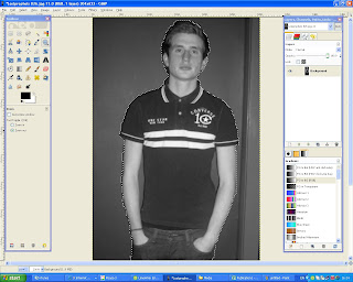
I used Gimp and Picasa to edit my pictures. The top picture is the main photo i am using for my front cover, firstly i put it into black and white and changed the brightness and shadowing using Picasa. Then i cut around the picture in gimp so i can put it against a dark grey background on my front cover, which is shown in the picture.
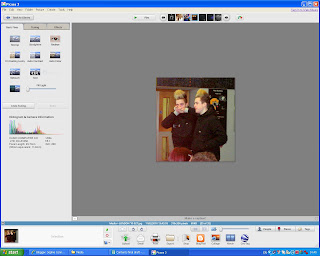
The second picture is when i was using Picasa to change the brightness of the photo, which will be featured in the contents page. As the original picture was quite dark i found Picasa the best way to change this.

Pictures


Here are some photo's i have taken to use on my magazine. The model used is an upcoming artist who will be featured in the interview of the magazine. I have taken three photo's in various settings, which also shows him in different clothing. I have also taken picture's of a crowd at a gig which i can use on the front cover or contents page.

Tuesday, 9 February 2010

Weekly Review

This week i have made some initial designs for the layout of my magazine. For the front page i tried various colour scheme's as well as different layouts. And for the contents page i tried it without the colour, as this will just be the same theme as the front cover. I still need to do some double page spread layouts, and need to start writing my interview.

Also i have chose the final font for my front cover and edited it to fit in with my front page. I used 'Gimp' for this which allowed me to crop and cut each letter out to paste onto my front page. I have decided the colour scheme is going to be a grey background, which black text and lime green straplines and things to make certain things stand out. I have chose a different font for cover lines on the magazine.

Next i will complete a design of my front cover using the inal fonts and colours chosen, and also apply these to the contents page and double page. Firstly i will do these without pictures, as i will put them in after. I still need to take various different pictures for my magazine.

Cover Line Font


This is the font i am going to use for the cover lines on my magazine. It is called 'Charles S' and is also off dafont. It is black and grey so fits in with the colour scheme.

Monday, 8 February 2010

Final Font


This is the font i have chose to use. I got it off dafont and will edit it to fit to the colour scheme of my magazine.

Wednesday, 3 February 2010

Double Page Layout Designs


This was my 1st idea, which i tried out using the colour scheme for my magazine. The actual interview only takes up the bottom half of the page, and is in four columns so that the text doesn't overlap the fold of the pages. There is a box to the right which gives the profile of the band/artist, which overlaps a small part of the interview. The pictures have a thick green border to make them stand out, and the heading will be in the corner of the page as oposed to in the middle.

This was my second idea, where i decided to separate the pages by using the whole first page for a picture, with the heading at the bottom of this. On the opposite page i have used 3 columns for the interview, and included a profile at the bottom, with another smaller picture overlapping this at an angle.

Contents Layout Designs

Idea 1

This was my first idea for a contents page. It includes the masthead at the top so it is recognisable to the magazine. The word contents is big and positioned at an angle so it stands out from th other text. There are 4 small pictures down the side to show the main features of the magazine whch will attract the readers. They have borders around to stand out from the background. There is a strapline at the bottom which could have more featues, or advertise a competition.


Idea 2
This was my second idea. Contents is written in the top corner of the page, with the masthead smaller in the opposite corner, again to give the magazine it's identity. The picture of the main story of the magazine will take up the majority of the page, and there will be two smaller pictures overlapping each oter next to it. They are at different angles so they look separate to the main picture. The bottom section of the page will show the features and page numbers. It also features a letter from the editor to make the magazine seem friendlier and to show that it is interacting with the reader. This is in a circle shape to differentiate it from the rectangular pictures.

Tuesday, 2 February 2010

Weekly Review

This week i have wrote a treatment, identifying the target audience and purpose of my magazine. I also started reseraching what type of layout i am going to use by looking at some existing magazines to find out what colour schemes and things i thought worked best. I then made some front page designs of my own, and next week i need to d the same for the contents page.

I have also decided to call my magazine 'Flux' and looked at some possible font ideas. I now need to do some more initial designs using these fonts, and start designing the contents and double page spread.

Possible Fonts


I used dafont.com to look for possible fonts to use on the front cover and contents page of my magazine. I looked at the distorted fonts as i thought this would fit in with the genre of my magazine, and i wanted it to be modern and unique.


These are my five favourites.


Possible names

For my magazine, i wanted a title that was original and that would appeal to the target audience. As the magazine was focused on indie music and upcoming talent of young people, it had to fit in with that.

- Distinct
- Captured
- Uncovered
- Bite
- Flux

These are the names that appealed to me. As i haven't really got time to get feedback from other, I have decided i am going to use 'Flux' as the title for my magazine, as i think because it's short it's more effective. Also it means 'always changing' which is what happens in the music world!

Magazine title: FLUX

Front Cover Layout Designs

Idea 1
This was my first idea for a front cover design. I chose it because i want my magazine to be quite simple so everything is clear and it's not too crowded. The cover lines are positioned so they don't take too much focus off the picture, and there is a strapline at the top and bottom of the page which could be in a contrasting colour to stand out.


Idea 2

For my second idea i am using a black and white picture to take up the whole background. It also uses red and yellow to make the 'exclusive' stand out.

Monday, 1 February 2010

Planning my photoshoot

For my photoshoot, i am planning on taking pictures of a boy in his late teens who will be the new artist my magazine is focusing on. He will be dressed quite stereotypically indie so will fit in with the theme of the magazine. I am going to take quite a few pictures, all with different set ups, so i can write about him in different setting and situations. Most of these will be mid or long shots.

I will need different pictures to feature on the contents page of the magazine, so i am hoping to get some of a crowd at a gig to advertise an upcoming event or to give information about one that's already happened. For this i will use different angled shots and they will probably be long shots.

I may also find other models, maybe female, to show other new artists.